-
Architects: Valerio Dewalt Train Associates
- Area: 34000 ft²
- Year: 2016
-
Photographs:Jasper Sanidad
-
Manufacturers: 3form, B Metals, Caesarstone, Escenium HAUS, Nydree, TechLighting

Text description provided by the architects. Adjusting to a growing workforce in San Francisco, Adobe found itself in need of more culinary space and they wanted to provide their employees with a new experience that would match their ambitions as a company. Having their offices housed within the historic Baker & Hamilton building, expansion and structural changes were strictly prohibited by the city. The process to solve this problem began with a close collaboration between the newly hired Chef, Mirit Cohen, and Valerio Dewalt Train with their in house Media Objectives Studio. Together, they explored new ways to optimize their existing space and create a new and diverse culinary experience for Adobe employees.

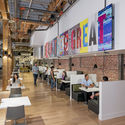
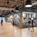
The first priority was to reorganize Adobe’s existing facilities. The wellness center was relocated and the main area was gutted to leave the beautiful timber structure exposed. Areas for serving stations were then pushed toward the periphery to create an open central seating space. This area provides a flexibility that allows for company gatherings, conferences and of course, dining. Furnished with soft seating, this area greets visitors below the existing skylight. Booths are incorporated into the periphery to provide areas for informal meetings.

Adobe’s new Town Hall embraces the Baker & Hamilton building’s history as a tool factory by incorporating the design concept of “Tools of the Trade” throughout the architecture, branding, and the culinary experience. The main space, dubbed Landmark 193, features custom signage composed of steel structure reminiscent of the Baker & Hamilton rooftop sign. Culinary tools are also celebrated in each of the servery stations, specifically featuring the kettle, plancha, hearth, rotisserie, grill, and Filter, the space’s coffee bar adjacent to Landmark 193. Each of these instruments are used to prepare meals for employees in new and innovative ways.

Surrounding these two spaces are large-scale custom fabricated aluminum screens. The subtly shifting patterns on these screens were CNC-cut using algorithmically-generated artwork, an intriguing and contemporary take on the space’s tooling concept. Surrounding furnishings use a muted color palette that accentuate and celebrate wood and brick from the existing building structure.

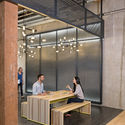
Behind the serving station is an area coined The Chef’s Table, which was designed to provide a unique dining experience. Enclosed to create a sense of intimacy, seating lines the outer part of the kitchen, allowing employees to watch the food preparation and feel part of the process. Darker lighting sets a different mood in this space, and the introduction of copper in the ceiling and bar stools sets an exclusive and unique tone to this area.

In order to streamline the guests’ dining experience, a new interactive menu system was developed for the culinary team. M-O worked with cafe management, chefs, developers, and architects to translate the cafe’s brand and support it’s functional needs into a system of interactive digital menus. By placing all of the menus’ information at guests’ fingertips at their point of decision, the entire culinary experience was transformed. The overwhelming acclaim for this menu system and culinary experience, has led to its expansion at Adobe cafes across the globe.


